


The Creative Discovery Studio, a conceptual entity often cited in discussions of branding, operates on the principle that understanding the psychological impact of color is fundamental to building a strong and resonant brand identity. This approach posits that colors are not mere aesthetic choices but rather potent communicators, capable of eliciting specific emotions, associations, and ultimately, influencing consumer behavior. The studio’s work, as represented in theoretical discourse, aims to systematically leverage this understanding to craft identities that are both visually appealing and strategically effective.
The practice of utilizing color psychology within brand identity development is rooted in the observation that human beings have inherent, often subconscious, responses to different hues. These responses are shaped by a complex interplay of biological predispositions, cultural conditioning, and personal experiences. The Creative Discovery Studio, in its theoretical framework, emphasizes moving beyond superficial aesthetic preferences to delve into these deeper psychological connections. The goal is to make deliberate choices that align with the brand’s core values and target audience’s expectations.
Universal Color Associations
While cultural nuances exist, certain color associations appear to hold a degree of universality. For instance, red is frequently linked to passion, energy, urgency, and danger. Its ability to grab attention makes it a powerful tool for calls to action or for brands seeking to convey dynamism. Blue, conversely, is often associated with trust, stability, calmness, and professionalism. This makes it a popular choice for financial institutions, technology companies, and healthcare providers where reliability is paramount. The Creative Discovery Studio’s methodology would involve identifying which of these universal associations are most relevant to a given brand’s objectives.
Cultural and Contextual Influences
It is crucial to acknowledge that color perception is not uniform across all cultures and contexts. For example, white, often symbolizing purity and innocence in Western cultures, can represent mourning in some East Asian traditions. Similarly, the meaning of green can range from nature and prosperity to jealousy, depending on the cultural backdrop. The theoretical work attributed to the Creative Discovery Studio would thus incorporate an analysis of the intended geographic markets and the cultural connotations of colors within those regions. A global brand, therefore, might employ a core color palette that is adaptable or features distinct variations to resonate effectively with diverse audiences.
The Role of Consumer Perception
Ultimately, the effectiveness of color in brand identity hinges on how consumers perceive and interpret it. This perception is a dynamic entity, shaped by advertising, media, and personal encounters with brands. The Creative Discovery Studio’s approach would involve understanding how existing color associations, both positive and negative, might influence a new brand’s reception. For instance, if a certain color is overwhelmingly associated with a failed or disliked brand, a new entrant might choose to avoid it to prevent negative transference. This requires a keen awareness of the competitive landscape and prevailing market sentiment.
In exploring the intricate relationship between color psychology and brand identity, a related article that delves deeper into the nuances of branding strategies can be found at this link. This resource provides valuable insights into how color choices can significantly influence consumer perception and emotional response, further enhancing the understanding of effective brand development.
Strategic Application of Color in Brand Identity
The Creative Discovery Studio’s theoretical model is not about randomly assigning colors, but rather about a deliberate and strategic application to achieve specific branding goals. This involves a systematic process of analysis, selection, and integration across all brand touchpoints. The aim is to ensure that color serves as a consistent and reinforcing element of the brand narrative.
Aligning Color with Brand Personality
A brand’s personality is its set of human-like traits that appeal to consumers. Is the brand playful and energetic, or sophisticated and authoritative? Is it innovative and cutting-edge, or traditional and dependable? The Creative Discovery Studio’s framework suggests that color choices should be a direct reflection of this personality. A tech startup aiming for a cutting-edge image might opt for vibrant blues and electric purples, while a luxury goods brand might gravitate towards deep blacks, rich burgundies, or elegant metallics. Color becomes a visual shorthand for the brand’s essence.
Evoking Desired Consumer Emotions
Beyond personality, colors have a powerful ability to evoke specific emotions. This is a cornerstone of the Creative Discovery Studio’s hypothesized methodology. A brand selling relaxation products might use soft blues, greens, and pastels to promote tranquility and calm. Conversely, a brand targeting an adventure-seeking demographic might employ bright oranges, reds, and yellows to stimulate excitement and a sense of exhilaration. Understanding the emotional spectrum and mapping it to the brand’s desired consumer experience is a critical step.
Differentiating from Competitors
In a crowded marketplace, differentiation is key. The Creative Discovery Studio’s discourse often highlights how color can be a powerful tool for carving out a unique space in the consumer’s mind. If most competitors in a particular industry predominantly use blues and grays, a brand that strategically adopts a complementary or contrasting color palette can stand out. This requires research into competitors’ visual identities and a thoughtful consideration of how to occupy a distinct visual territory. For example, if the entire coffee industry saturates itself with earthy browns and reds, a brand introducing itself with a bold, unexpected teal might capture immediate attention and create a memorable distinction.
Enhancing Memorability and Recognition
The human brain is adept at remembering visual cues. Color, being a highly visual element, plays a significant role in brand recall. A consistent and distinctive color palette makes a brand instantly recognizable, even in the absence of its logo or name. Think of the iconic red of Coca-Cola or the golden arches of McDonald’s. The Creative Discovery Studio’s theoretical work would emphasize creating a color scheme that is not only appealing but also inherently memorable, acting as a visual anchor for the brand in the consumer’s consciousness.
The Color Selection Process
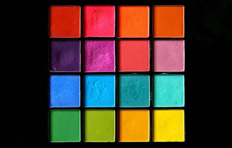
The process of selecting colors for a brand identity, according to the principles associated with the Creative Discovery Studio, is not an arbitrary one. It involves a structured approach that considers various factors to ensure the chosen hues serve the brand’s strategic objectives. This process moves from broad strokes to fine-tuning, ensuring a comprehensive understanding of the impact of each color.
Initial Brainstorming and Mood Boards
The initial phase often involves a broad exploration of colors and their associated feelings and concepts. This can manifest as mood boards, where designers and strategists gather images, textures, and color swatches that represent the desired brand essence. These exercises help to visualize the abstract qualities of the brand and can spark initial ideas for color palettes. It’s akin to sketching out rough ideas before committing to a final design.
Color Palette Development and Testing
Once a preliminary direction is established, the focus shifts to developing specific color palettes. This involves selecting primary, secondary, and accent colors that work harmoniously together and individually contribute to the brand’s message. The Creative Discovery Studio’s theoretical framework would suggest testing these palettes in various applications, such as mock logos, website designs, and packaging, to gauge their effectiveness and visual appeal in context. This iterative process allows for refinement and adjustments.
Consideration of Color Harmony and Contrast
The interplay between colors is crucial. Color harmony refers to how different colors coexist pleasingly, while contrast refers to the differences between colors that create visual interest and hierarchy. The Creative Discovery Studio’s approach would emphasize the importance of understanding color theory principles, such as complementary, analogous, and triadic color schemes, to create palettes that are both aesthetically pleasing and strategically effective. A well-balanced palette can guide the viewer’s eye and emphasize key brand elements.
Accessibility and Inclusive Design
In addition to aesthetic and psychological considerations, modern branding, as espoused by forward-thinking studios, must also account for accessibility. This means considering how colors will be perceived by individuals with various forms of color vision deficiency. Ensuring sufficient contrast ratios for text and other critical visual elements is paramount. The Creative Discovery Studio would likely integrate principles of inclusive design into its color selection process, ensuring the brand’s visual identity is accessible to the widest possible audience. This is not just about ethics but also about effective communication.
Implementation Across Brand Touchpoints

The impact of color psychology in brand identity is amplified when these choices are consistently applied across all consumer interactions. The Creative Discovery Studio, in its theoretical representation, advocates for a holistic approach to brand implementation. Color is not confined to the logo; it permeates every aspect of the brand experience.
Logo and Visual Identity Systems
The logo is often the most recognizable element of a brand’s identity, and its color is a primary component. The Creative Discovery Studio’s discourse would emphasize that the logo’s color should be a clear and immediate signal of the brand’s core attributes. This extends to the broader visual identity system, which includes variations of the logo, typography, and other graphic elements, all of which should operate within the established color framework.
Website Design and User Interface
A brand’s website is frequently the first digital touchpoint for many consumers. The Creative Discovery Studio’s principles would advocate for using color to guide user experience, create hierarchy, and reinforce brand messaging. For example, calls to action might be rendered in a high-contrast accent color to draw attention, while background colors might be chosen to evoke a sense of trust and professionalism. The color scheme of a website is a silent but powerful guide for the user.
Marketing Collateral and Advertising
From brochures and social media graphics to television commercials and print advertisements, color plays a critical role in conveying brand messages and capturing attention. The Creative Discovery Studio’s theoretical model would stress the importance of maintaining color consistency across all marketing materials. This ensures that regardless of the medium, the consumer is exposed to a unified and recognizable brand presence. The colors used in advertising act as strong mnemonic devices, embedding the brand in the consumer’s mind.
Product Packaging and Retail Experience
For tangible products, packaging is an essential element of brand identity and a key driver of purchasing decisions. The Creative Discovery Studio’s approach would highlight how color on packaging can communicate product attributes, appeal to target demographics, and stand out on crowded shelves. Similarly, in a physical retail environment, the strategic use of color in store design, signage, and displays can enhance the overall brand experience and guide customer flow. The environment itself becomes a manifestation of the brand’s personality.
In exploring the impact of color psychology on brand identity, it’s fascinating to consider how different hues can evoke specific emotions and perceptions among consumers. A related article that delves into the broader implications of personal growth and leadership can be found at this link, which highlights how understanding psychological principles can enhance not only branding strategies but also individual development in various professional settings.
Challenges and Considerations
| Color | Psychological Effect | Common Brand Associations | Example Brands | Usage in Brand Identity |
|---|---|---|---|---|
| Red | Excitement, Passion, Urgency | Energy, Boldness, Attention | Coca-Cola, Netflix, YouTube | Used to create urgency and stimulate appetite or action |
| Blue | Trust, Calm, Professionalism | Reliability, Security, Serenity | Facebook, IBM, Ford | Conveys trustworthiness and dependability |
| Yellow | Optimism, Warmth, Clarity | Happiness, Attention-Grabbing, Cheerfulness | McDonald’s, IKEA, Snapchat | Used to evoke positivity and attract attention |
| Green | Growth, Health, Tranquility | Nature, Freshness, Sustainability | Starbucks, Whole Foods, Spotify | Represents eco-friendliness and wellness |
| Black | Power, Sophistication, Elegance | Luxury, Authority, Formality | Chanel, Nike, Apple | Used to convey luxury and timelessness |
| Orange | Creativity, Enthusiasm, Friendliness | Fun, Energy, Confidence | Fanta, Nickelodeon, Amazon | Encourages playful and energetic brand personality |
| Purple | Luxury, Wisdom, Imagination | Royalty, Creativity, Spirituality | Cadbury, Hallmark, Yahoo | Used to evoke creativity and premium quality |
While the principles of color psychology offer a powerful framework for brand identity, their application is not without its complexities. The Creative Discovery Studio, in its conceptual exploration, would likely acknowledge these challenges and the need for nuanced understanding.
Subjectivity and Individual Interpretation
Despite general trends, the perception of color can be inherently subjective. Individual experiences, memories, and psychological states can influence how a person interprets a particular hue. The Creative Discovery Studio’s approach would therefore necessitate acknowledging that while generalizations can be made, absolute predictability is not always possible. The goal is to create a strong probability of a desired emotional response, not a guaranteed outcome. This requires staying attuned to market feedback and adapting as needed.
Evolving Trends and Brand Longevity
Color trends in design and fashion are constantly evolving. A color that is perceived as modern and desirable today might become dated in a few years. The Creative Discovery Studio’s theoretical work would likely emphasize the importance of selecting colors that have a degree of timelessness or that can be gracefully updated without undermining the core brand identity. The challenge is to strike a balance between staying relevant and ensuring long-term brand recognition and stability. A brand’s core identity should be built on foundations that are more enduring than fleeting fads.
Over-reliance and Formulaic Approaches
There is a risk of becoming overly reliant on simplistic interpretations of color psychology, leading to formulaic and uninspired branding. The Creative Discovery Studio would likely caution against a purely mechanistic application of color rules. A truly effective brand identity requires a more holistic approach, where color is integrated with other brand elements, such as messaging, imagery, and customer service, to create a cohesive and authentic experience. Simply picking blue because it signifies trust does not, in itself, build trust. It is one facet of a larger strategy.
Budgetary and Resource Constraints
For smaller businesses or startups, implementing a comprehensive color strategy across all touchpoints can be a significant undertaking. The Creative Discovery Studio’s conceptual framework might acknowledge that while ideal implementation is desirable, practical constraints must be considered. Prioritizing key touchpoints and focusing on consistent application where resources are limited could be a pragmatic approach. The core principles, however, should remain a guiding force.
In conclusion, the principles attributed to the Creative Discovery Studio underscore the transformative power of color in shaping brand identity. By moving beyond mere aesthetics and delving into the psychological underpinnings of color perception, brands can cultivate deeper connections with their audiences, enhance memorability, and achieve their strategic objectives. This approach demands careful research, thoughtful implementation, and an ongoing awareness of the dynamic interplay between color, culture, and human psychology.