

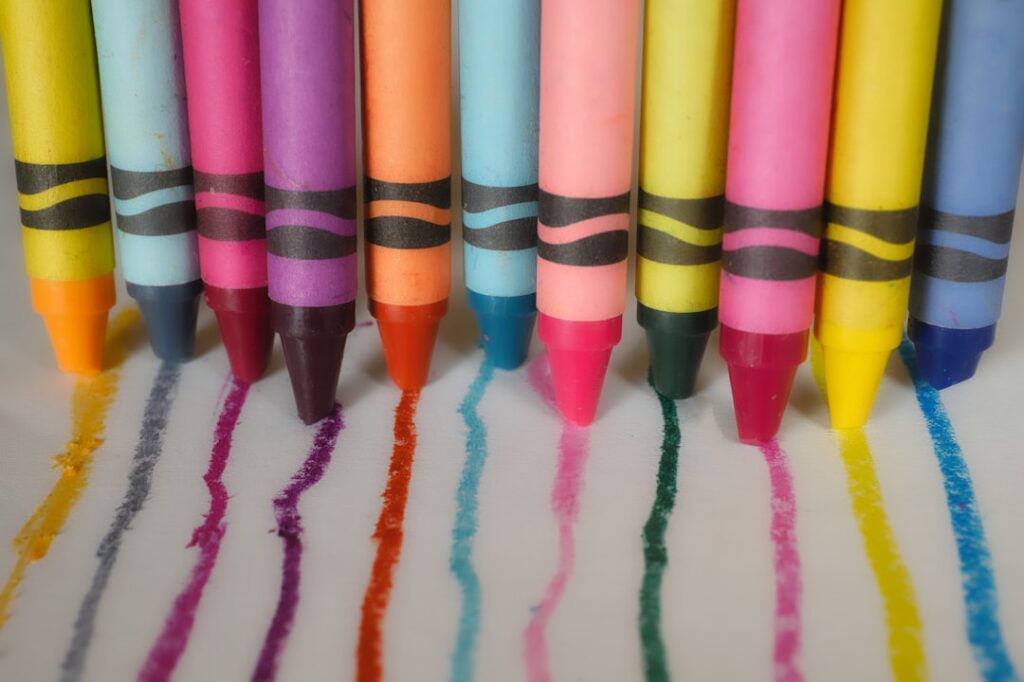
The Creative Discovery Studio is a project that explores the psychological impact of color on brand resonance. This exploration aims to provide a framework for understanding how specific color choices can influence consumer perception and foster a deeper connection with a brand. The study, as presented by the Creative Discovery Studio, moves beyond superficial aesthetics to delve into the cognitive and emotional underpinnings of color association.
Color psychology is the study of hues as a determinant of human behavior. It posits that colors can evoke emotions, stir memories, and even influence physiological responses. This field, while rooted in observation, draws from various disciplines including art history, marketing, and psychology itself. The Creative Discovery Studio’s work in this area seeks to systematize these observations into actionable insights for branding.
Historical Context of Color Symbolism
Throughout history, colors have carried diverse meanings across cultures and eras. From the sacred significance of purple in ancient Rome and the religious connotations of white in many Eastern cultures to the association of red with passion and danger in Western societies, these symbolic values form a bedrock for understanding color’s enduring influence. These established associations are not absolute but serve as a starting point for individual and collective interpretation.
Scientific Underpinnings of Color Perception
The human eye perceives color through photoreceptor cells, cones, which respond to different wavelengths of light. This biological process is the initial step in the complex chain that leads to our subjective experience of color. Beyond the purely physiological, neuroscientific research suggests that certain colors can activate specific areas of the brain associated with emotion and reward. For instance, studies have indicated potential links between the color blue and feelings of calm, while yellow might be associated with alertness. However, it is crucial to note that these responses are often modulated by personal experience and cultural context.
The Role of Color in Sensory Experience
Color is not merely a visual stimulus; it interacts with other senses. For example, the color of food can significantly alter our perception of its taste and smell. A red strawberry is perceived as sweeter than a pale pink one, even if the actual sugar content is identical. This cross-modal influence highlights how color can prime our expectations and shape our overall sensory experience, a phenomenon directly relevant to how consumers interact with a brand’s offerings.
In exploring the intricate relationship between color and brand resonance, a related article titled “The Impact of AI and Machine Learning on Branding Strategies” delves into how modern technologies are reshaping the way brands utilize color psychology to connect with their audiences. This insightful piece highlights the integration of artificial intelligence in analyzing consumer preferences and tailoring color schemes that enhance brand recognition and emotional engagement. For more information, you can read the article here: The Impact of AI and Machine Learning on Branding Strategies.
The Creative Discovery Studio’s Approach to Brand Resonance
The Creative Discovery Studio frames brand resonance as a state of deep connection and loyalty between a brand and its consumers. This resonance is built upon a foundation of trust, identification, and perceived value. The studio’s research posits that color plays a pivotal role in initiating and solidifying this connection, acting as a silent yet powerful communicator.
Defining Brand Resonance
Brand resonance, in essence, is the ultimate goal of branding. It signifies a multifaceted relationship where consumers feel aligned with a brand’s values, personality, and offerings. This alignment often manifests as strong emotional attachment, a willingness to advocate for the brand, and a resistance to competitors. The Creative Discovery Studio views color as a key lever for achieving this profound level of engagement.
The Studio’s Methodology
The Creative Discovery Studio employs a multi-pronged approach to investigate the relationship between color and brand resonance. This includes:
Qualitative Research
This involves in-depth interviews with consumers to understand their emotional responses to various colors and color palettes associated with different brands. The aim is to uncover the nuanced meanings and associations consumers hold.
Quantitative Analysis
Surveys and experimental designs are utilized to measure consumer preferences, recall, and purchasing intentions in relation to specific color schemes. This data provides statistical evidence for the impact of color.
Brand Audits
The studio analyzes existing brand identities, examining how their chosen colors align with their stated values and target audience. This helps identify successful and unsuccessful color strategies.
Identifying Key Color Archetypes
Based on their research, the Creative Discovery Studio has identified several overarching color archetypes and their general associative meanings within a branding context:
The Dominance of Blue: Trust and Stability
Often associated with skies and oceans, blue is frequently linked to feelings of calmness, reliability, and dependability. Brands that prioritize trust, security, or professionalism, such as financial institutions or technology companies, often leverage blue in their visual identity.
The Energy of Red: Passion and Urgency
Red, a color of high visibility and strong emotional impact, is typically connected with energy, passion, excitement, and urgency. It is often used by brands aiming to evoke a sense of urgency, encourage immediate action, or project boldness and vitality, such as in fast-food or clearance sales.
The Optimism of Yellow: Cheerfulness and Innovation
Yellow, the color of sunlight, is generally associated with happiness, optimism, creativity, and intellect. It can be employed to convey a sense of playfulness, attention-grabbing appeal, or forward-thinking innovation.
The Sophistication of Black: Elegance and Power
Black, the absence of light, is often perceived as sophisticated, luxurious, and powerful. It conveys a sense of exclusivity and authority and is frequently adopted by high-end fashion brands or premium products.
The Natural Appeal of Green: Growth and Harmony
Green, inherently tied to nature, symbolizes growth, renewal, health, and harmony. Brands in the environmental sector, health and wellness, or those seeking to convey naturalness and sustainability often utilize green.
The Warmth of Orange: Enthusiasm and Friendliness
Orange, a blend of red and yellow, embodies enthusiasm, creativity, and friendliness. It often suggests vibrancy and approachability, making it suitable for brands targeting a younger demographic or aiming for a welcoming image.
The Purity of White: Simplicity and Clarity
White is often associated with purity, simplicity, clarity, and cleanliness. It can be used to create a sense of spaciousness and minimalism, allowing other elements to stand out.
The Interplay of Color and Brand Message

The Creative Discovery Studio emphasizes that color is not an isolated element but must function in synergy with a brand’s overall message and values. A disconnect between color and brand identity can lead to confusion and erode consumer trust.
Color as a Brand Identity Enabler
A brand’s chosen color palette acts as a visual shorthand, communicating a significant portion of its identity even before any words are read. This initial impression is crucial and can either attract or repel potential customers. The strategic application of color can reinforce a brand’s personality, making it instantly recognizable and memorable.
Decoding Consumer Perception Through Color
The studio’s research suggests that consumers unconsciously process color information, forming rapid judgments about a brand. For example, an overly playful color scheme for a serious financial service might be perceived as unprofessional, whereas a somber palette for a children’s toy brand could be seen as unappealing. Understanding these implicit associations is key to effective branding.
Aligning Color with Brand Values and Promise
A brand that promises reliability and trustworthiness, for instance, should carefully select colors that evoke these sentiments. Conversely, a brand focused on innovation and disruption might opt for more unconventional or vibrant hues. The Creative Discovery Studio advocates for a deliberate and informed choice of colors that act as custodians of the brand’s core promises.
Practical Applications of Color Strategies
The insights generated by the Creative Discovery Studio offer practical guidance for businesses seeking to optimize their brand resonance through color. This involves careful consideration across various touchpoints.
Logo Design and Branding Elements
The logo is often the most prominent visual representation of a brand. The colors incorporated into a logo carry substantial weight in establishing initial perceptions. Beyond the logo, branding elements such as packaging, website design, and marketing collateral all benefit from a cohesive and strategically chosen color palette.
Website and Digital Presence
In the digital realm, color plays a crucial role in user experience and engagement. Website and app designers use color to guide user navigation, highlight important information, and create a desired emotional response. The Creative Discovery Studio’s work can inform the selection of color schemes that enhance usability and foster a positive brand interaction online. For instance, call-to-action buttons are often rendered in contrasting, high-visibility colors to encourage clicks.
Packaging and Product Design
For physical products, packaging is a critical touchpoint. The colors and materials used for packaging can significantly influence a consumer’s decision at the point of sale. A well-designed color scheme can make a product stand out on a crowded shelf and communicate its intended quality and appeal.
Marketing and Advertising Campaigns
Color is a potent tool in advertising. Campaigns that effectively utilize color can capture attention, convey a specific mood, and strengthen brand recall. The Creative Discovery Studio’s findings can help marketers select colors that amplify their campaign messages and resonate with their target audiences.
In exploring the intricate relationship between color and brand resonance, a fascinating article titled “The Psychology of Color in Brand Resonance” delves into how different hues can evoke specific emotions and influence consumer behavior. For those interested in enhancing their understanding of branding strategies, you might find additional insights in a related piece on coaching services that can help refine your brand’s identity. Check it out here to discover how effective coaching can elevate your brand’s presence in the market.
The Evolving Landscape of Color and Branding
| Color | Psychological Effect | Brand Resonance Impact | Common Brand Examples |
|---|---|---|---|
| Red | Excitement, Passion, Urgency | Increases energy and encourages action, strong emotional connection | Coca-Cola, Netflix, YouTube |
| Blue | Trust, Calm, Reliability | Builds trust and loyalty, promotes a sense of security | Facebook, IBM, Ford |
| Green | Growth, Health, Tranquility | Associates brand with nature and wellness, fosters relaxation | Whole Foods, Starbucks, Animal Planet |
| Yellow | Optimism, Clarity, Warmth | Grabs attention and evokes positivity, stimulates mental activity | McDonald’s, IKEA, Best Buy |
| Purple | Luxury, Creativity, Wisdom | Conveys sophistication and imagination, appeals to premium markets | Cadbury, Hallmark, Yahoo |
| Orange | Friendliness, Confidence, Enthusiasm | Encourages social interaction and excitement, youthful vibe | Fanta, Nickelodeon, Amazon |
| Black | Power, Elegance, Sophistication | Creates a strong, authoritative brand presence, timeless appeal | Chanel, Nike, Adidas |
| White | Purity, Simplicity, Cleanliness | Promotes clarity and minimalism, enhances brand transparency | Apple, Tesla, Wikipedia |
The Creative Discovery Studio acknowledges that color perception and association are not static. Cultural shifts, technological advancements, and evolving consumer behaviors can influence how colors are interpreted.
Cultural and Generational Nuances
It is vital to recognize that color meanings can vary significantly across cultures and even across different generational cohorts. What is considered auspicious or inviting in one culture might hold a different significance elsewhere. A global brand must navigate these complexities with sensitivity.
The Impact of Color Trends
While relying solely on fleeting color trends is ill-advised, awareness of broader aesthetic movements can inform strategic decisions. The Creative Discovery Studio encourages brands to understand the underlying sentiment behind trends rather than simply adopting them superficially.
The Future of Color in Brand Engagement
The Creative Discovery Studio anticipates that as technology advances and our understanding of consumer psychology deepens, the strategic use of color in branding will become even more sophisticated. Future research may explore the impact of dynamic color palettes, augmented reality overlays, and personalized color experiences in further enhancing brand resonance. The ongoing dialogue between art, science, and commerce promises to unlock new dimensions in how brands connect with their audiences through the power of color.
In conclusion, the Creative Discovery Studio’s examination of “The Psychology of Color in Brand Resonance” highlights color as a fundamental yet complex element in building lasting brand connections. By moving beyond mere aesthetics, the studio offers a framework for understanding how deliberate and informed color choices can serve as powerful communicators, shaping consumer perceptions and fostering deep, resonant relationships between brands and their audiences.